Urban Heat Portal
Extreme heat doesn't hit every New York City neighborhood the same way. I designed a unified home for the city's scattered heat data, so advocacy groups and local government could turn it into arguments for heat-resilient policy.
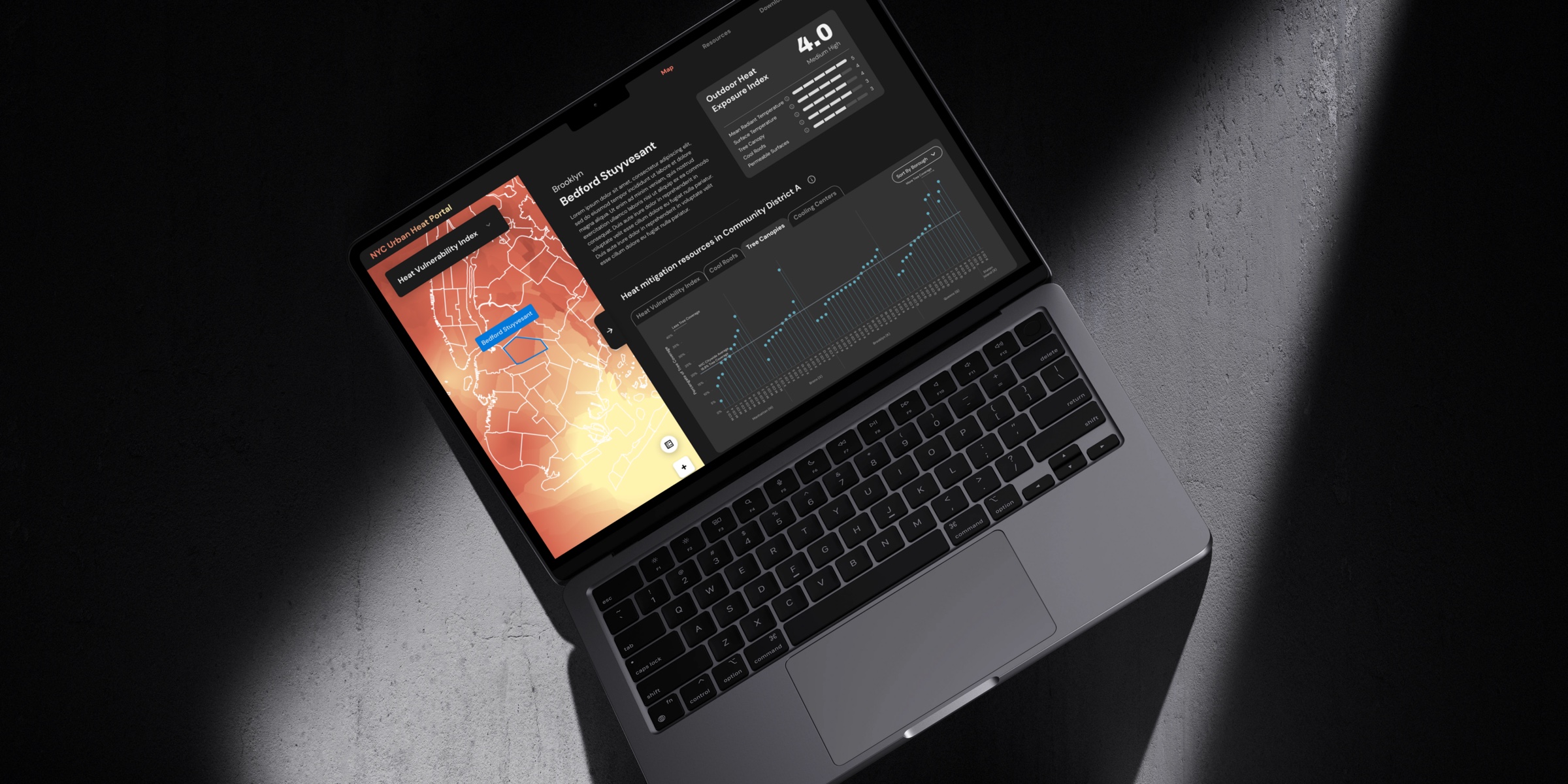
Heat data existed. It was hard to find, process, and understand.
Extreme heat is one of the most under-addressed climate risks in the city. The data to act on it already existed, it just lived in disconnected spreadsheets, agency PDFs, and research portals that weren't built for the people who needed them most.
Synthesizing the research team's interviews with 8 advocacy groups, mostly data-curious advocates rather than data experts, I found three recurring barriers.
Help advocates understand what urban heat data means for their neighborhood, without needing a data scientist.
Supporting heat-resilience advocacy and research-driven policy in New York City.
Discover, define, design, deliver
I designed alongside a data model that was still being built. Many design changes followed shifts in the data structure, and the designs gave the team a shared picture of the final product to keep the conversation on usability going.
The map is the homepage. Everything branches from it.
Hover a neighborhood for a tooltip, click for its full profile, then download the report. Click to enlarge
How to make it easy for users to navigate nine overlapping data layers
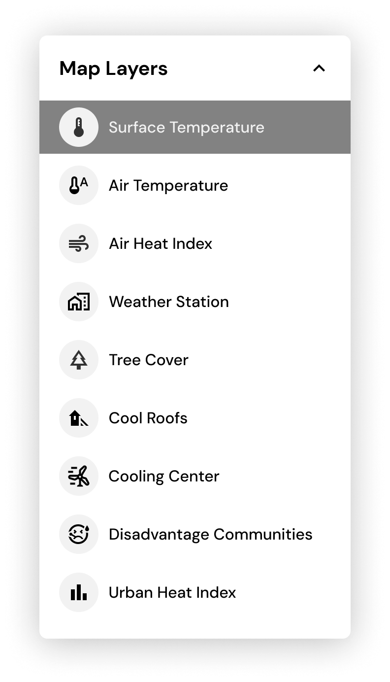
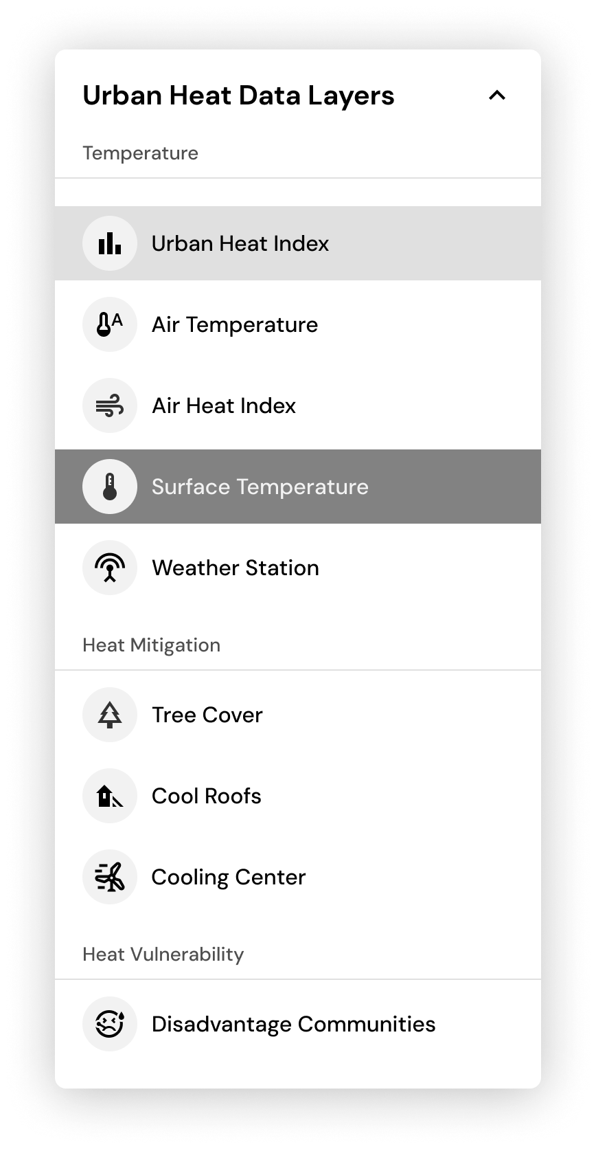
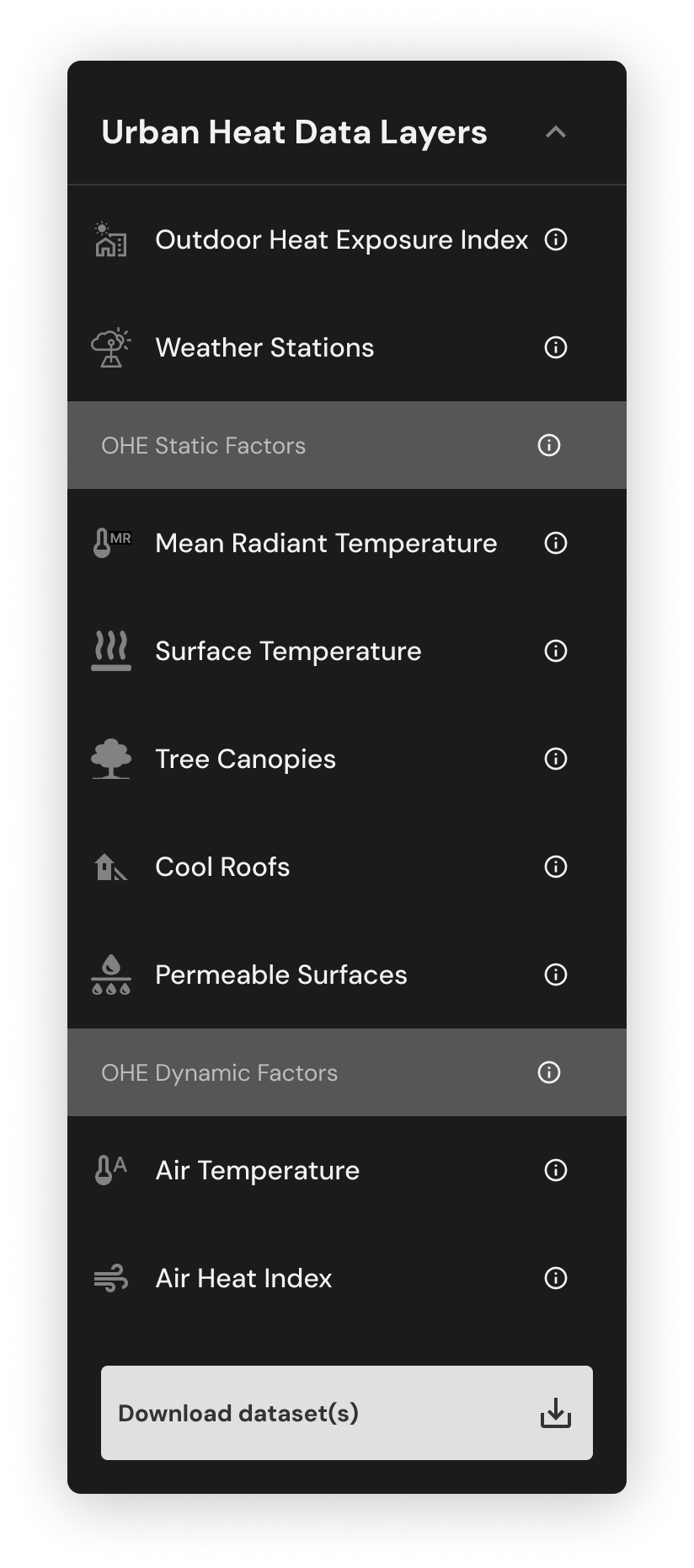
Data once scattered across sources now lives as layers on one map, so the control panel had to work as the product's main navigation.
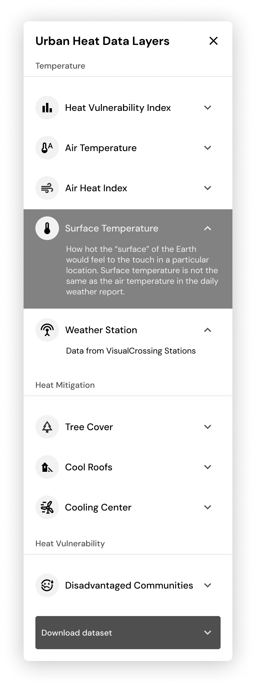
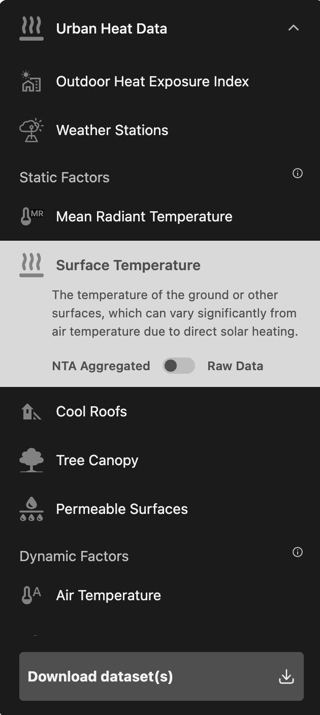
My first version was a flat list, fast to scan. Grouping layers into categories made related data easier to find, but names like "Mean Radiant Temperature" still meant nothing to a non-expert. So I added a plain-language description to each layer, shown only when it's active, to keep the list short.
Then the data team reorganized the layers into static and dynamic factors to match their model, and I restructured the panel around it. I set it in dark so it reads as a separate surface from the bright heat map underneath.

How to serve both advocates who need an answer and researchers who need the data
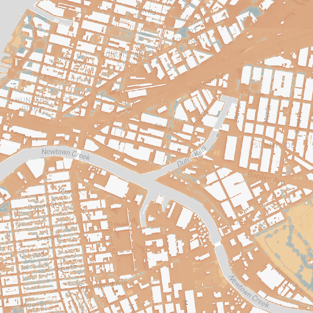
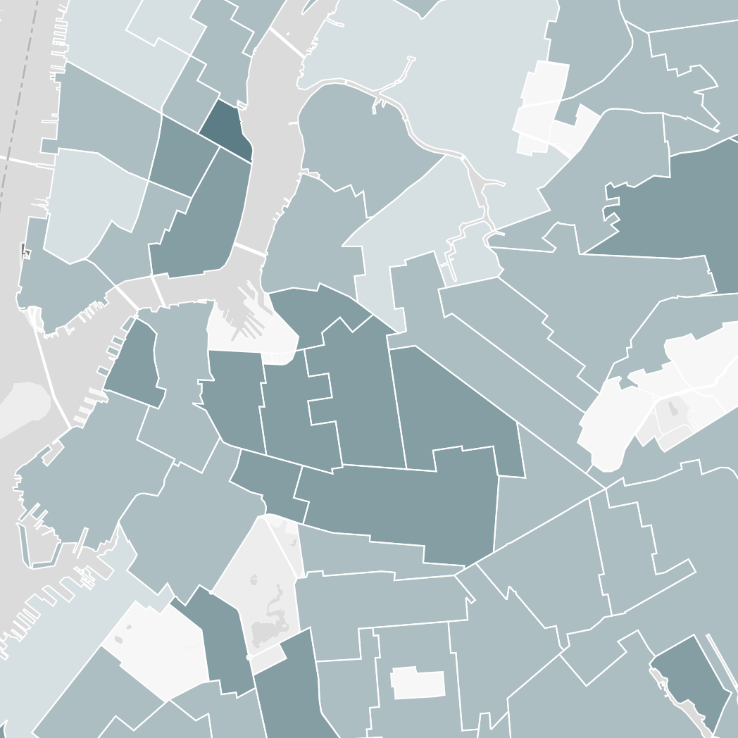
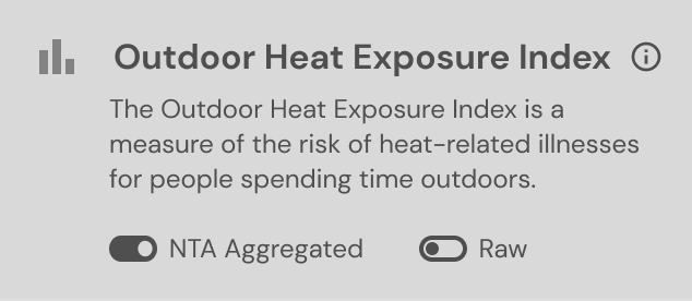
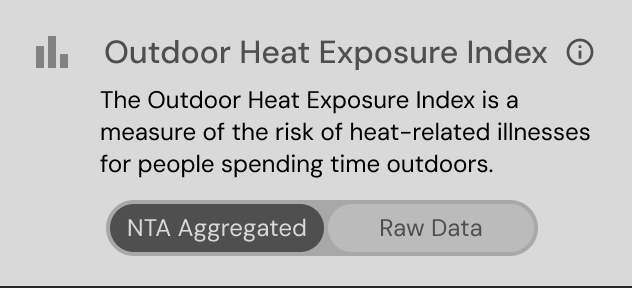
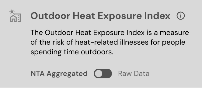
Advocates range from data-curious to data-skilled, the same spread as these three formats. Rather than design for one audience, the portal lets each user start where they are:
- Aggregated by neighborhood (default): the answer to "how is my area doing?"
- Raw data on the map: a toggle inside the active layer, so going deeper never takes users away from what they're looking at.
- Download dataset(s): fixed at the bottom of the panel, making the portal a source for their own analysis, not just a viewer.
How to help users understand what the data means for their neighborhood
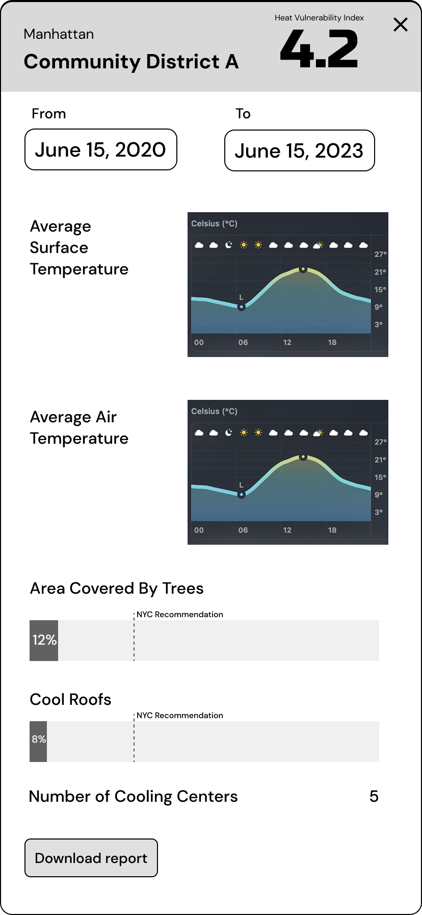
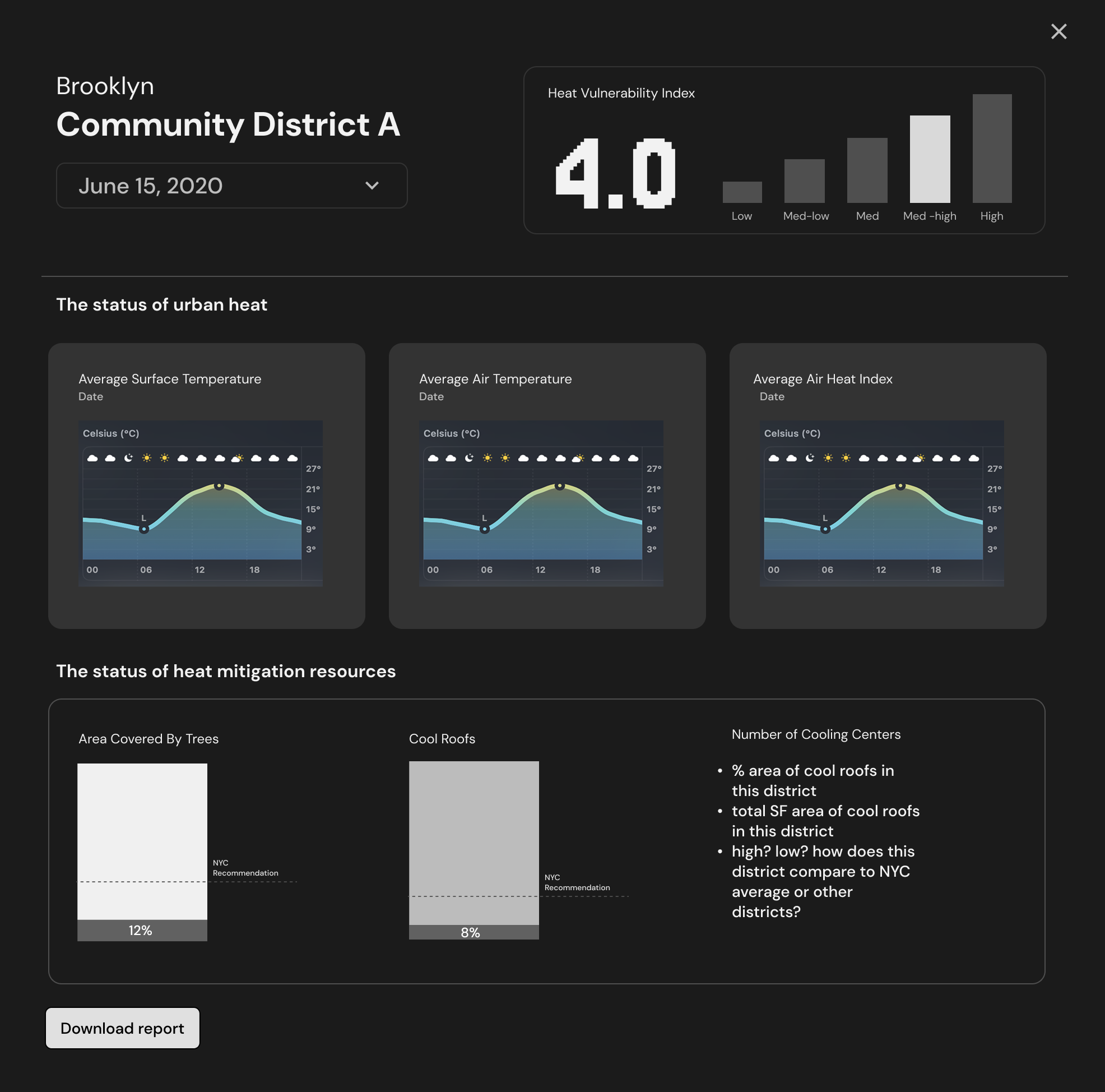
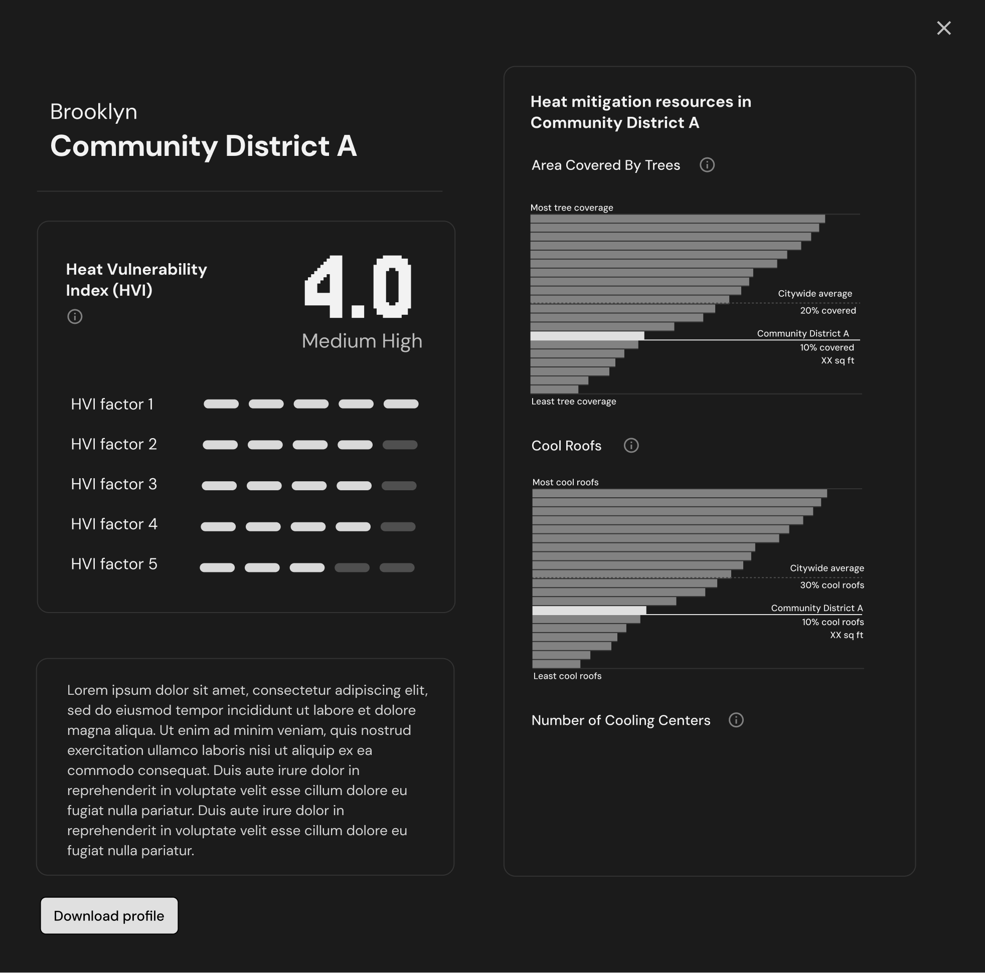
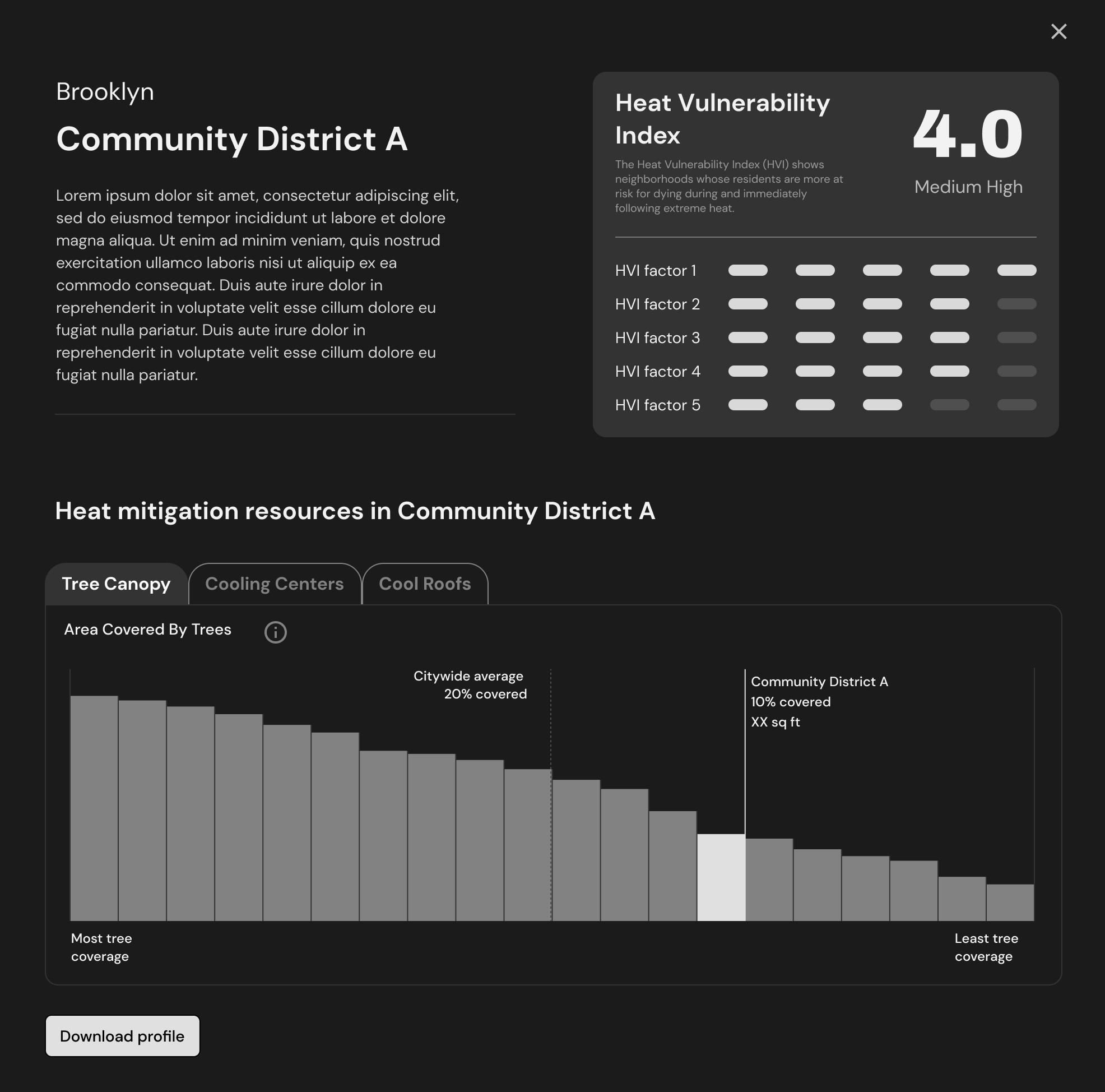
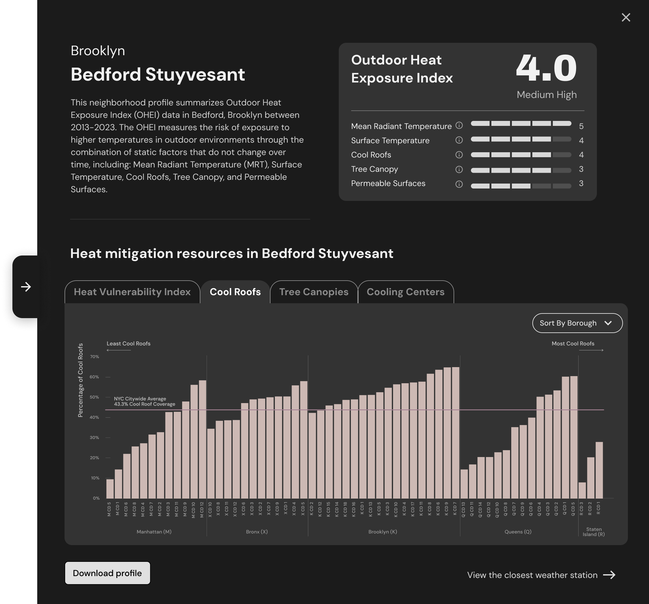
Even with heat readings in hand, advocates can't see what they mean for a specific neighborhood. That takes what the research team did: weigh five outdoor environmental factors against each other and turn them into one measure of risk. That measure is the Outdoor Heat Exposure Index, a score for how exposed each neighborhood is to heat on summer days. It gives advocates a number they can act on: to see where their neighborhood stands, raise awareness, and make the case for policy.
My job was to make that index readable for non-experts. I started before it was finalized, and early versions buried the score among raw temperature charts, with nothing to say whether a district was doing well or badly. Over five rounds I cut the raw data, broke the score into its five factors on one 1–5 scale, and added a comparison against every district in its borough.
Shipped, and still live
The portal launched publicly in April 2025, built on this design, and is still live at urbanheat.nyc ↗.
Community organizations and local governments now have one free, public source for neighborhood heat data, with the analysis already done, to build the case for heat-resilient policy.
I handed off before launch, so measurement wasn't set up. Next time I'd agree on signals with the team up front: dataset downloads, return visits from advocacy partners, and citations in testimony, reports, or grant applications.
What I'd carry into the next project
Civic tools are built for people who rarely get a say in them. Without earning revenue, there's little pressure to invest in how they're designed. But this is where it matters most: these tools help New Yorkers navigate systems that shape their daily lives.
Working alongside researchers and data scientists, I learned how raw, visualized, and aggregated data each behave on a map. That fluency let me keep pace with the data team as the model evolved.