I defined how Verizon’s Family and Home apps share parental controls, and got it approved for build.
Parents managed the same child in two apps that didn’t talk to each other. I did the research, wireflows and strategy work that turned them into one experience.
Business objective
Unify the parental controls experience across Verizon Family and Home apps, so families have a reason to keep mobile and home internet together.
Results
My role
The team’s only product designer.
- Mapped both apps’ backends to surface the technical constraints
- Designed the experience, explored two paths: a merged profile (2.0) as the long-term vision, and app linking (1.0) as what could ship within technical limits
ValueMade a cross-team idea concrete enough to approve
- Researched parenting styles, child development and COPPA compliance
- Led competitive analysis, briefing Senior Directors and the VP of Design
- Quantified the impact with real usage data across both apps
ValueReframed two separate app experiences into one product, with a clear choice for leadership
Details
The full case study is password protected
This case study is confidential. Enter the password or email me at haileehoa.design@gmail.com to request access.
Two products, two apps, one child
Home internet and mobile service are two separate Verizon services, run through two separate apps. Parental controls in each app worked independently.
A parent with Verizon mobile and Verizon home internet managed one child in two places: the Home app for wifi devices, the Family app for cellular. The apps used different terms and navigation for the same controls, and nothing kept them in sync.
Same child, same device, no shared profile between the two apps
Turn two disconnected parental controls into one experience across the Family and Home apps, so the mobile + home internet bundle is more valuable.
That drives engagement and loyalty and reduces churn.
Click to enlarge
Two systems that only meet in one place
Before designing screens, I mapped how each app actually applies a rule. Family and Home each run their own stack, from app to service to filtering vendor to device, with nothing shared along the way. The two connect at only one point.
Click to enlarge
Scope to what could ship, keep the vision in view
A true merge needed backend work nobody had scoped. Linking through that one shared point could ship now.
Designed on top of the screens parents already use
Home and Family are owned by separate app teams with their own design authority: two design teams, two product teams, the continuity PM, and mine. I built the flows on existing screens and designed only the new UI, so the conversation stayed focused on the linking model and logic.
Click to enlarge
Click to enlarge
One profile for both apps
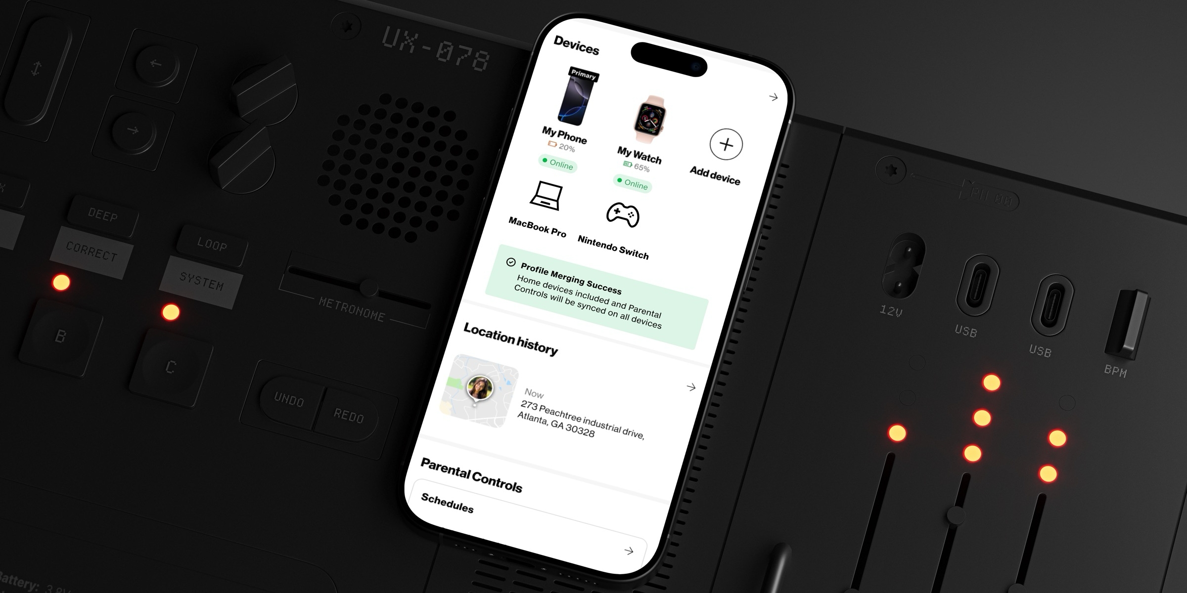
I audited the Home profile (3 sections) and the Family profile (11), then combined shared features into 6 sections. Features unique to one app stay in that app.
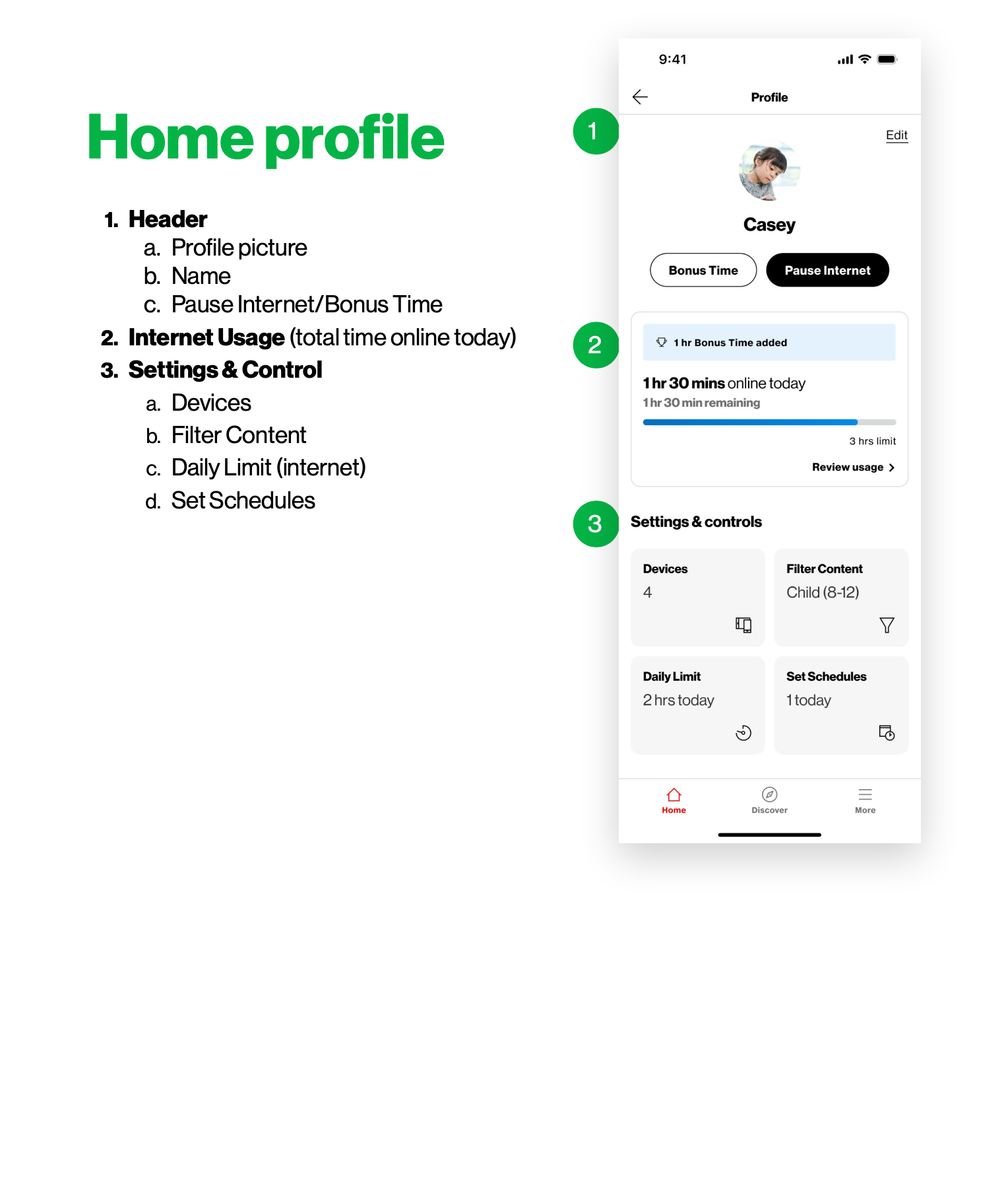
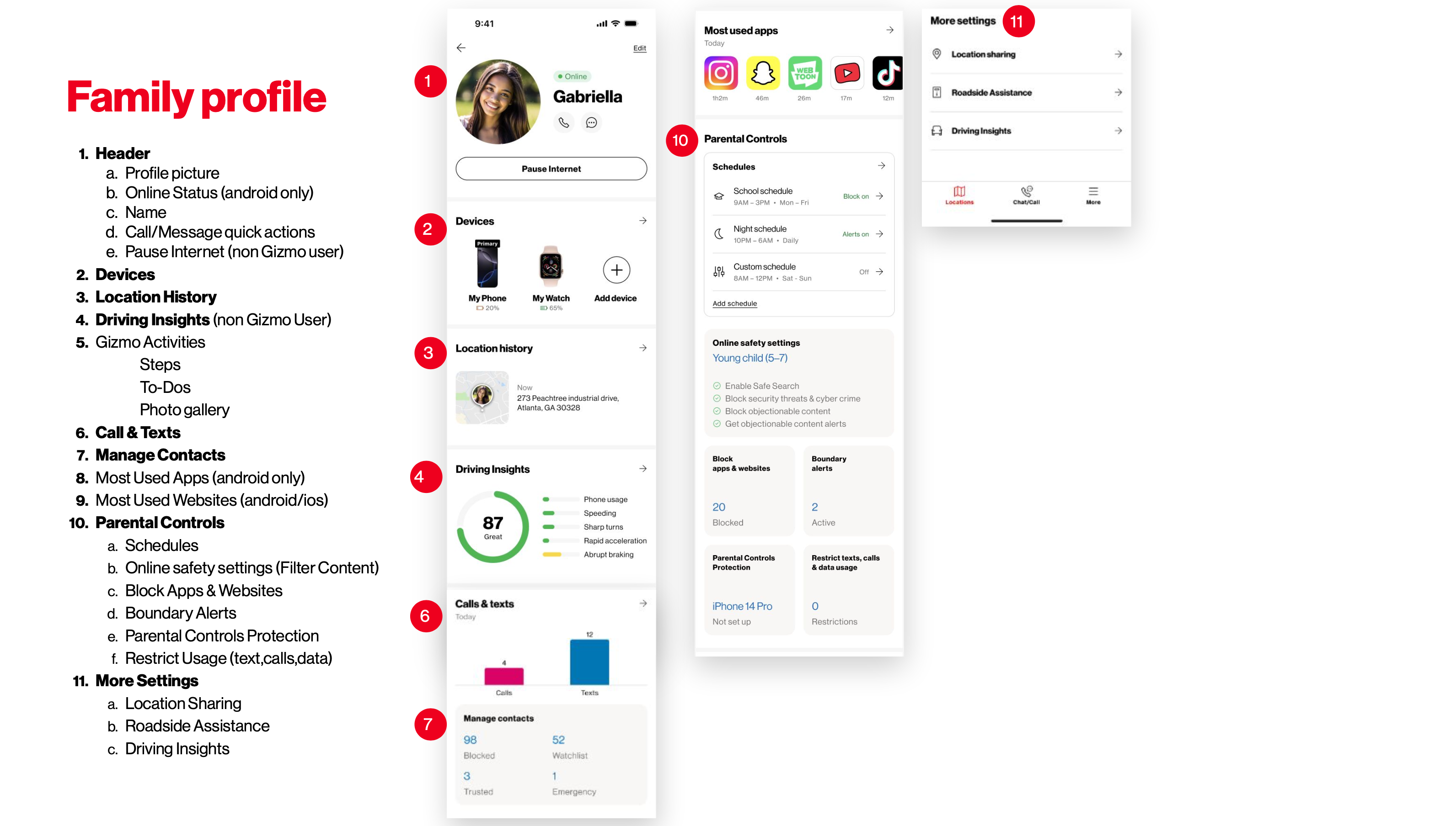
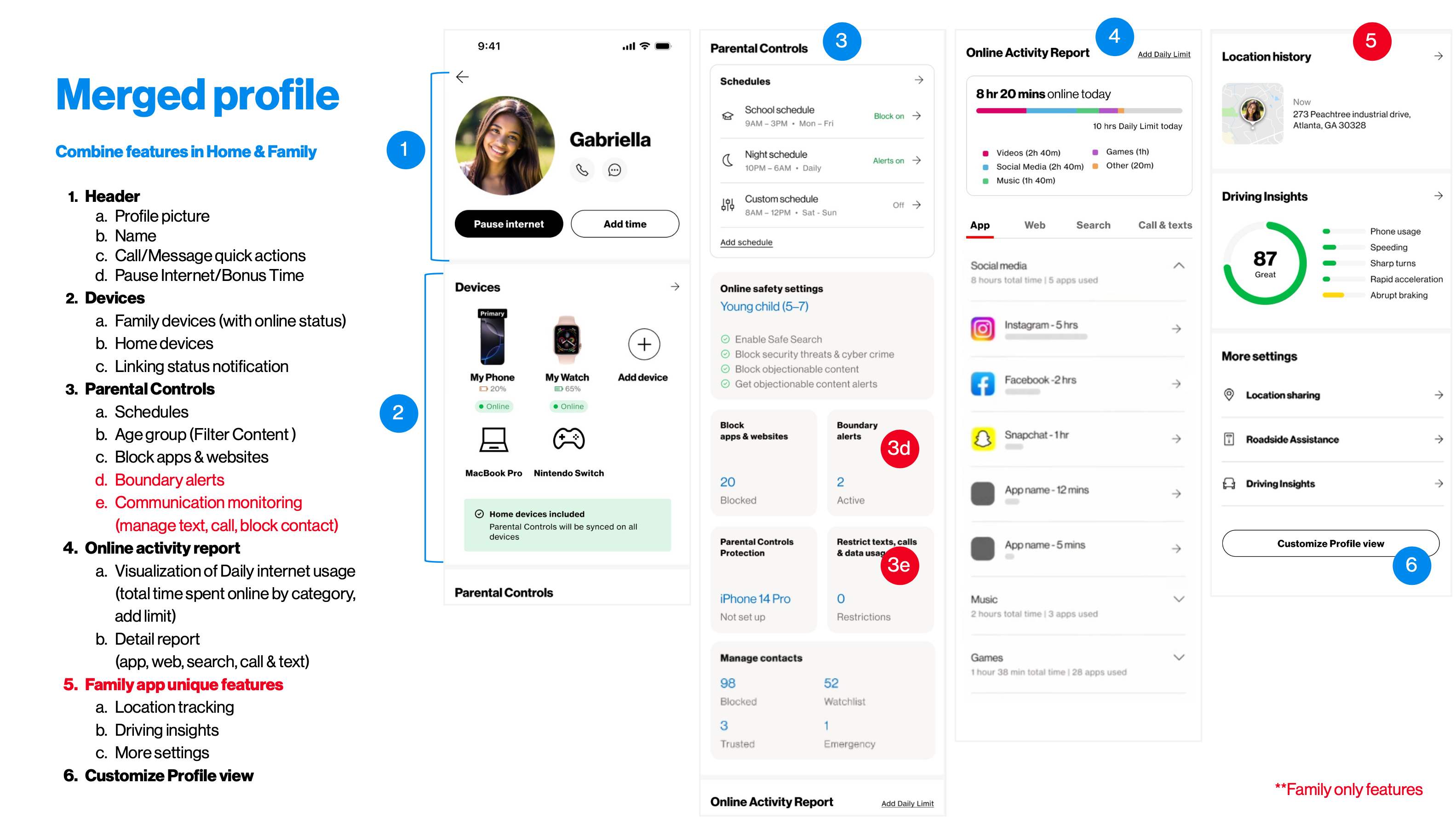
Structure I defined, assembled from existing screens of both apps.
Start from what parents are trying to do, not what the apps already do
What families are trying to protect, and how that changes as a child grows.
What they make controllable, and what they attach controls to.
Compliance needs for a linked child profile, and real usage across both apps to size the case.
Competitors protect either a child’s devices or the home network. The market leader covers both.
Framed Parental Controls in Home & Family as one system, since Verizon owns both the home network and the mobile network.
The two apps overlap on most content and screen-time controls, so parents configure the same rules twice.
Prioritized linking the apps over adding new features, so rules are set once.
Parents set rules by the child, not the device. Competitors already organize controls around a child profile.
Linked at the child-profile level, so each child keeps rules that fit them.
From proposal to build-track
Both paths, backed by the research and market analysis, brought to the senior director and VP.
Partnered with the team responsible for continuity across Verizon’s apps to turn the research into a specific, actionable plan, narrowed the proposal to what one partnership could deliver.
UX requirements fed into the product requirements document, headed toward production.
The design was the easy part. Finding who could say yes wasn’t.
Next time, I’d map who owns each decision as early and as carefully as I mapped the backend.